Smarter Search Experience

 Seerist Search redesign
TEAM
2 PMs & 10 Engineers & 7 Customer Service Managers
ROLE
Lead Product designer

TIMELINE
8 Months
Outcome

40% ↑

Faster time-to-insight
Reduced the time from submitting a search to opening a result.

20%↓

Fewer round trips
Reduced unnecessary back-and-forth between filters, views, and results.

4.5 /5

Ease of finding results
Based on post-launch customer feedback.

Overview

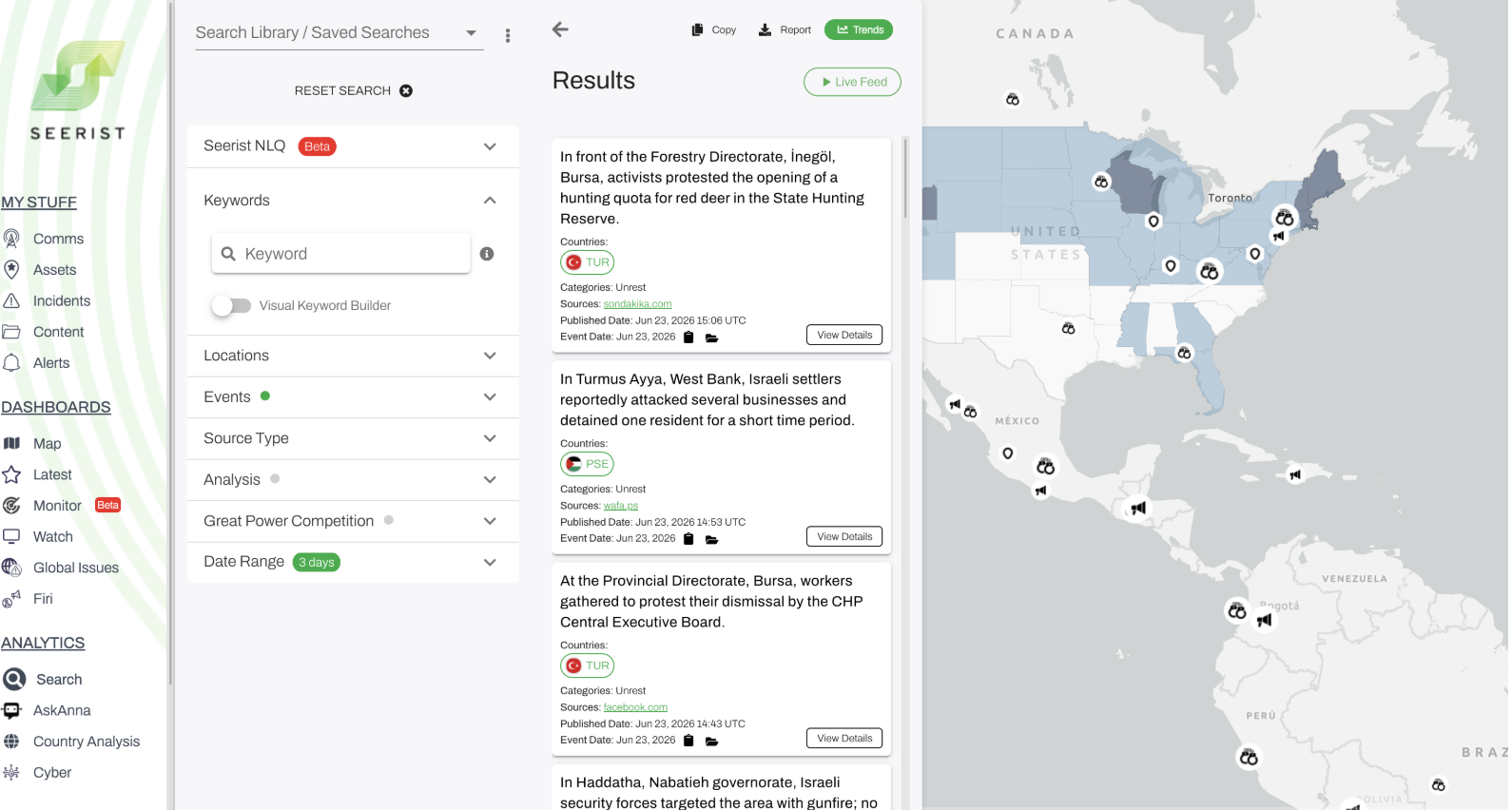
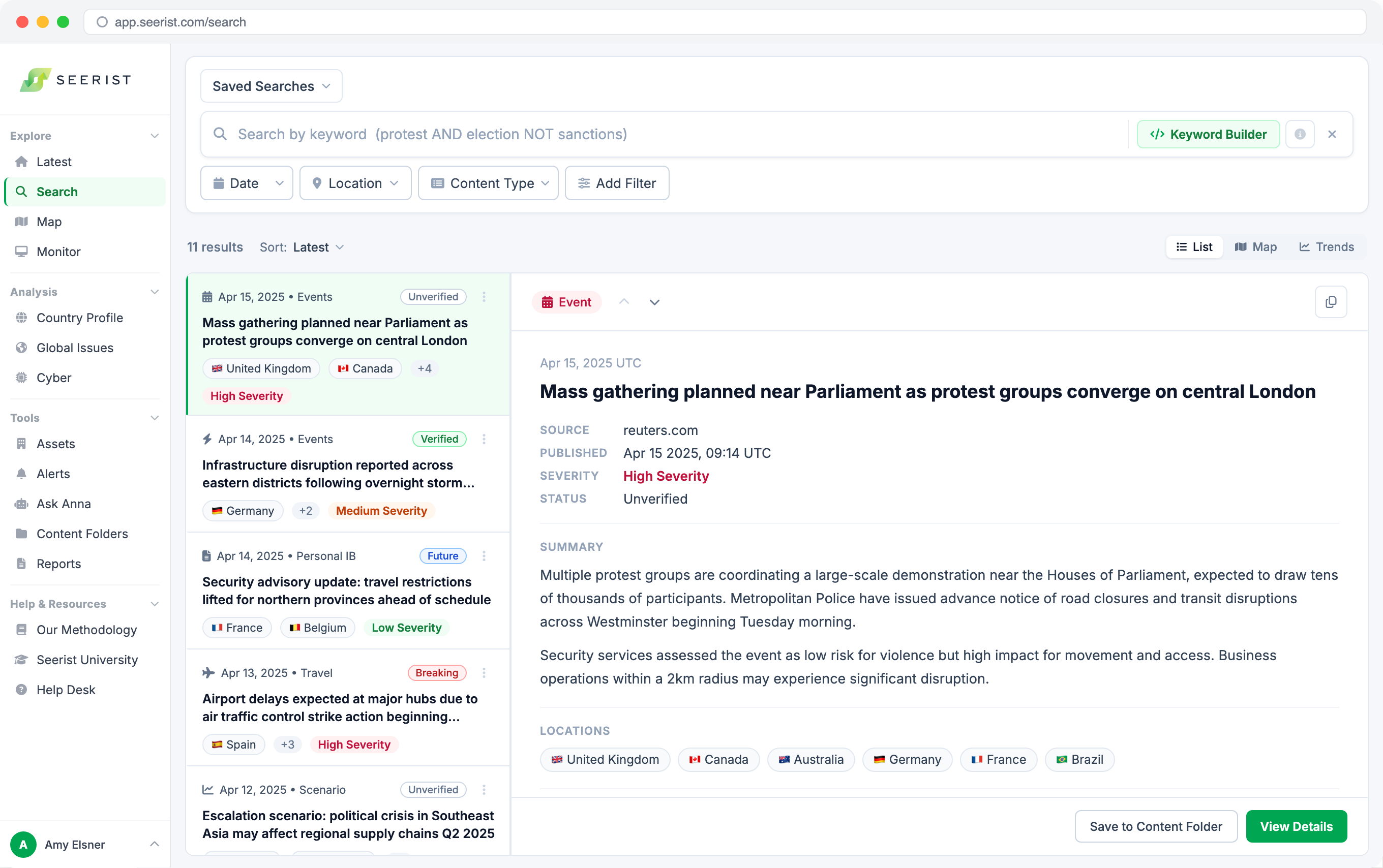
How search used to look
Every day, security analysts use Seerist to understand what is happening around the world and make decisions that impact people, operations, and safety. The platform takes in thousands of new events, reports, and signals every day. Search is the primary way users access that intelligence.

Problem
Search was built around the system, not the analyst.

The experience reflected how Seerist organized information internally, requiring users to understand the product before they could get value from it.

To find the right information, analysts needed to know:
Which keywords to use
Which filters mattered
Where features lived
How content was structured

In a workflow where speed mattered, that product knowledge created unnecessary friction and slowed access to critical insights.

The product was powerful. The challenge was making that power accessible.

Aligning around the right problem

With competing ideas across a 19-person team and unclear priorities, I led workshops that mapped the workflow, grounded decisions in research, and aligned the team around one shared direction.
Understanding the user
The analyst's job is making decisions under uncertainty.
Analysts work with incomplete, constantly changing information. They don't come to Seerist thinking about keywords or Boolean queries. They come with questions they need answered.
Detect what is happening
"What is happening around my assets?"
want
A fast way to understand activity around a specific area.
Understand the bigger picture
"Is this situation becoming a risk?"
want
Patterns, trends, and historical context.
Explore emerging threats
"What should we be watching?"
want
Relevant intelligence they may not know exists.

Discovery

Users didn't need more capability. They needed less friction.
Research revealed five areas where Search was making it harder for analysts to find what they needed.
01
Valuable tools were hidden
Saved Searches, Trends, and the Visual Keyword Builder could save analysts significant time, but many users never discovered them.
02
Starting from zero was difficult
An empty search field assumed users already knew exactly what they were looking for.
03
Filters matched the database, not the workflow
Common actions like filtering by location or date required unnecessary effort.
04
Search required too much expertise
Users had to understand Seerist's structure before they could effectively use it.
05
The system was unclear
Users often could not tell why they were seeing certain results, or how their choices affected the outcome.

Together, these barriers revealed the same underlying problem: too much of the experience depended on what users already knew.

Design principle
Remove what users have to know.
How do we make Seerist's intelligence accessible without requiring users to become experts in Seerist first?
01
Make powerful tools discoverable
02
Organize controls around analyst workflows
03
Help users start with confidence
04
Make the system explain itself
01 Make intelligence easier to access
Users shouldn’t have to know a feature exists before benefiting from it.
Powerful features like the Visual Keyword Builder, Saved Searches, and Trends were difficult to discover. I surfaced them directly within the search experience.
RESULT
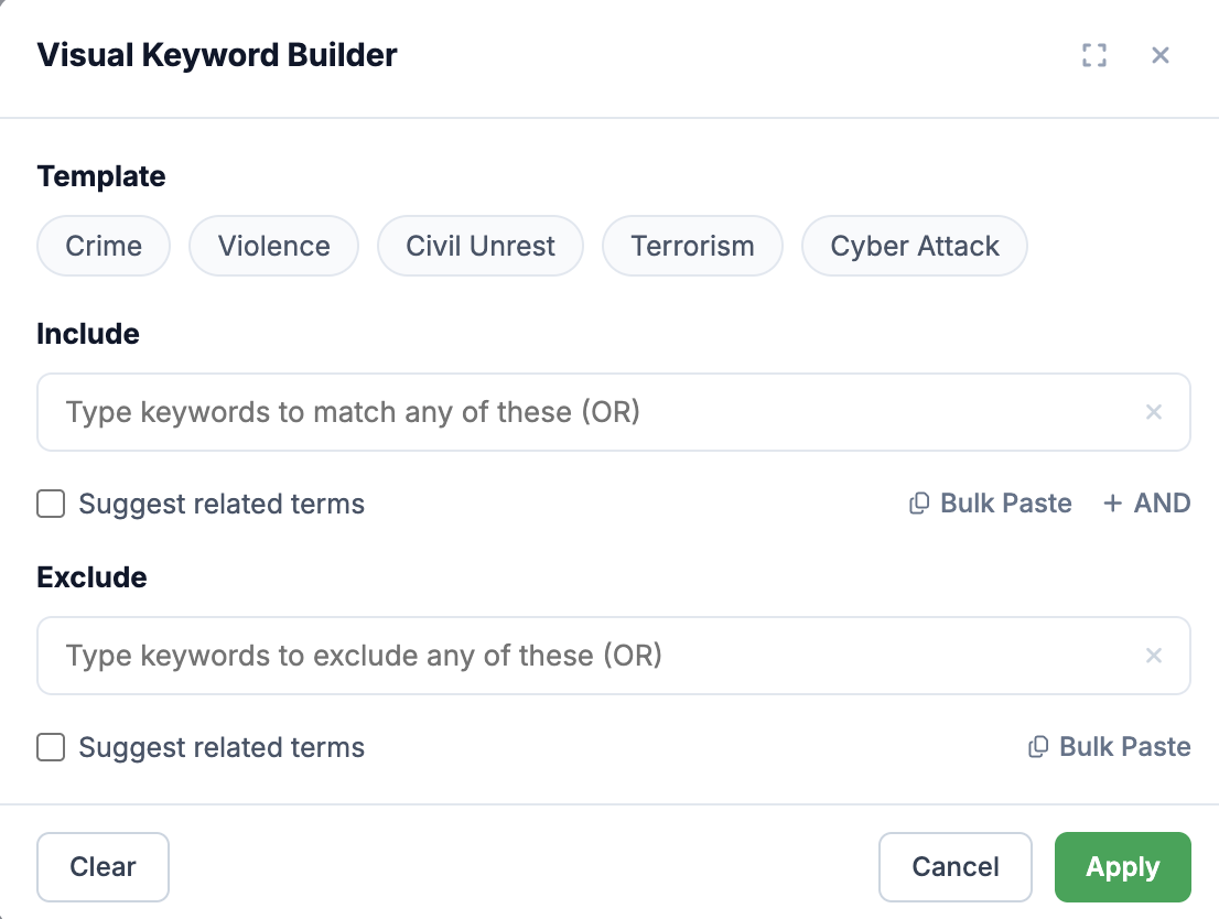
The Visual Keyword Builder became a guided workspace where analysts could build precise searches using include and exclude terms, without needing to know Boolean syntax.
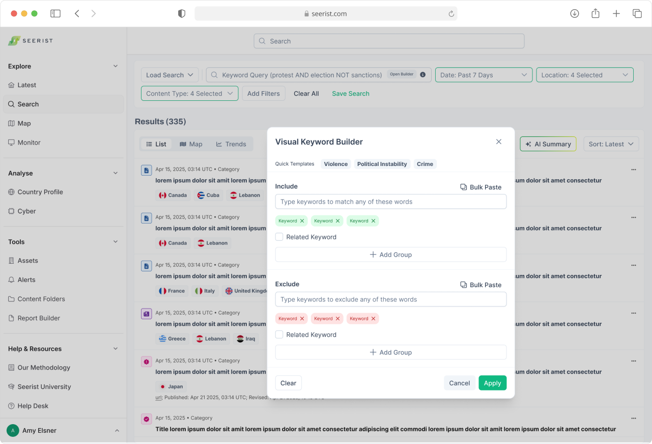
Visual Keyword Builder with include and exclude fields and inline guidance
02 Design filters around decisions, not data structure
The best filter is the one users can find when they need it.
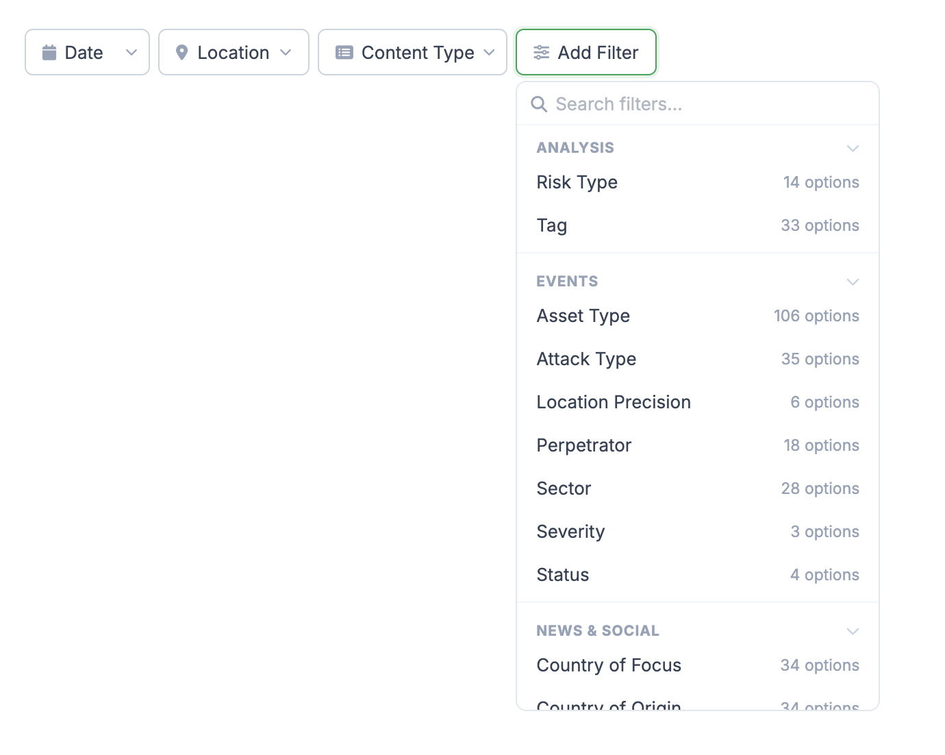
Previously, filters reflected how information was stored. I reorganized them around how analysts worked.
RESULT
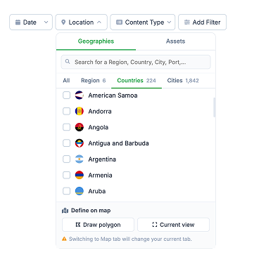
  • Location became one unified control instead of multiple geographic menus
  • Date and Content Type became immediately accessible
  • Less frequently used options moved behind Add Filter
Hard Call
Show every control or strip it all back? I did neither. Usage data showed which filters mattered most, so I kept those visible and moved the rest one click away.
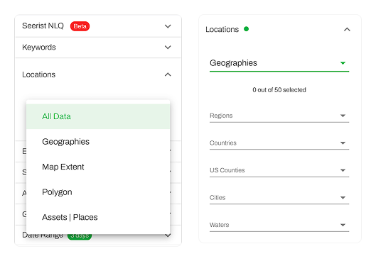
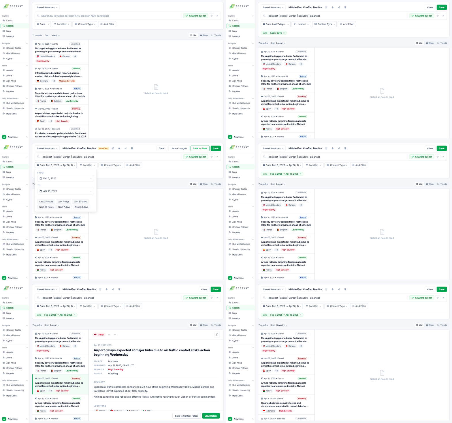
Before: Location filters spread across 7+ menus
After: Location filters consolidated into one control
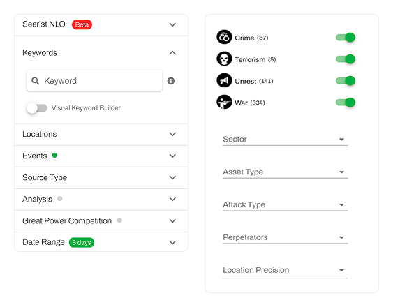
Before: All filters exposed, making relevant options harder to find.
Before: Key filters surfaced, with everything else organized in one menu.
03Help analysts begin with confidence
An empty search field put too much on the user. Instead of expecting analysts to know the perfect search, I gave them clearer ways to get started.
New
Keyword Templates
Prebuilt terms help analysts start a search faster.
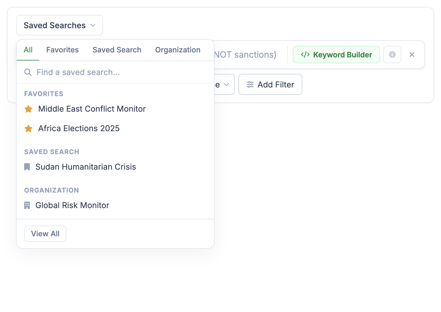
SURFACED
Saved Searches
Quick access to frequently used searches without rebuilding them.
SURFACED
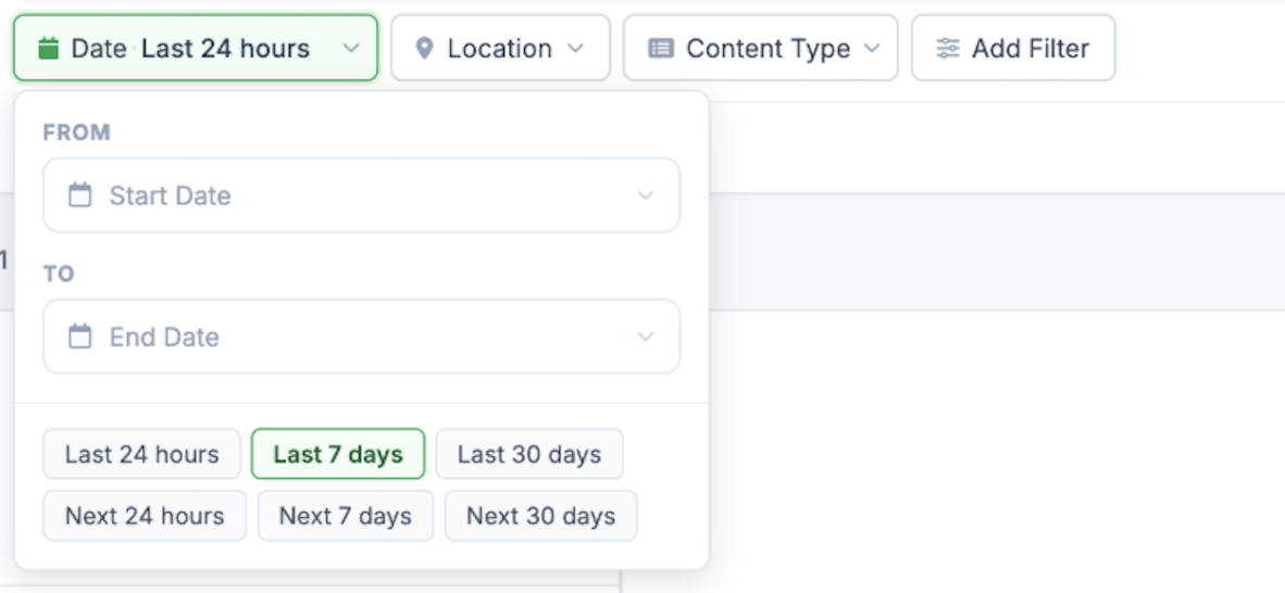
Quick Date Ranges
Common date ranges make frequent selections faster.

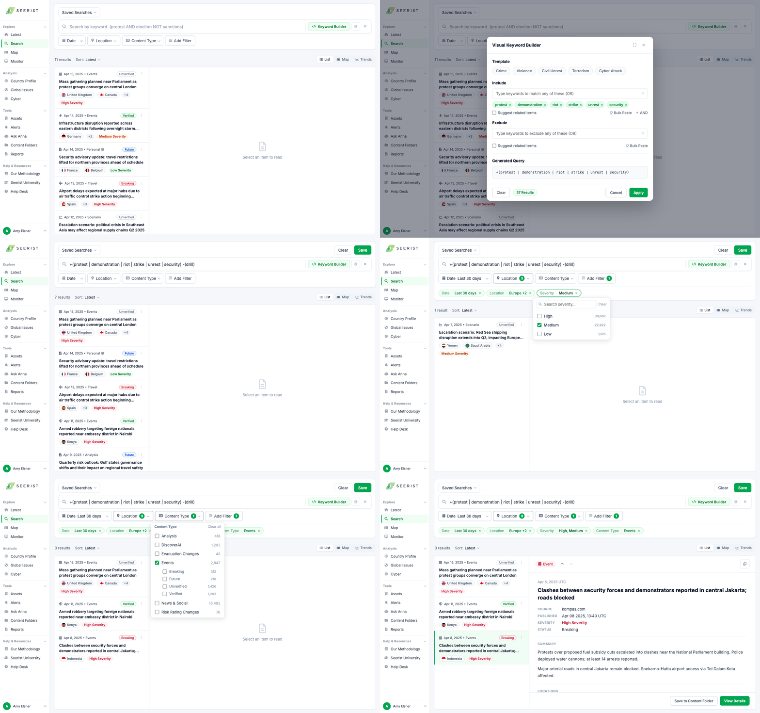
Search gave analysts a starting point, then helped them refine it.

04 Make Search explain itself
Analysts needed clearer feedback, so I made key search states more visible.
  • Clear active filter states
  • Immediate feedback when selections changed
  • Accurate result counts for large datasets
Example: Result counts capped at 10,000 looked exact. Adding “+” made the limit clear, preventing a misleading count.

10,000

10,000+

Design

Impact

"Much more intuitive than the previous version. You can tell it was built for how we actually work."
"I had no idea the search library was here. This would have saved me so much time, I just ran a search last week where I needed exactly this."
"The new keyword search is so much faster. The old one was confusing, this actually makes sense."

What I'd do next

Saved filter viewsFilters reset every session, forcing analysts to rebuild the same setup each morning. The next step would be saved filter configurations that let users return directly to their preferred workspace.
Recent SearchesMany users return to the same searches repeatedly. Making those searches immediately accessible would reduce the effort of finding and rebuilding them each time.