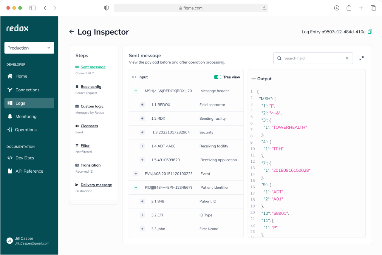

Log inspector

Team
1 PM & 8 Engineers
role
Product Designer (scoping, research, interaction, visual)

timeline
6 Months


Outcome
Hours of guesswork became minutes of clarity.

90%↑

Faster support resolution time
Enabling support team to resolve customer issues directly using the tool.

34% ↓

Fewer support tickets
Enabling users to troubleshoot issues independently.

Overview

Redox is where scattered patient data finally gets along.
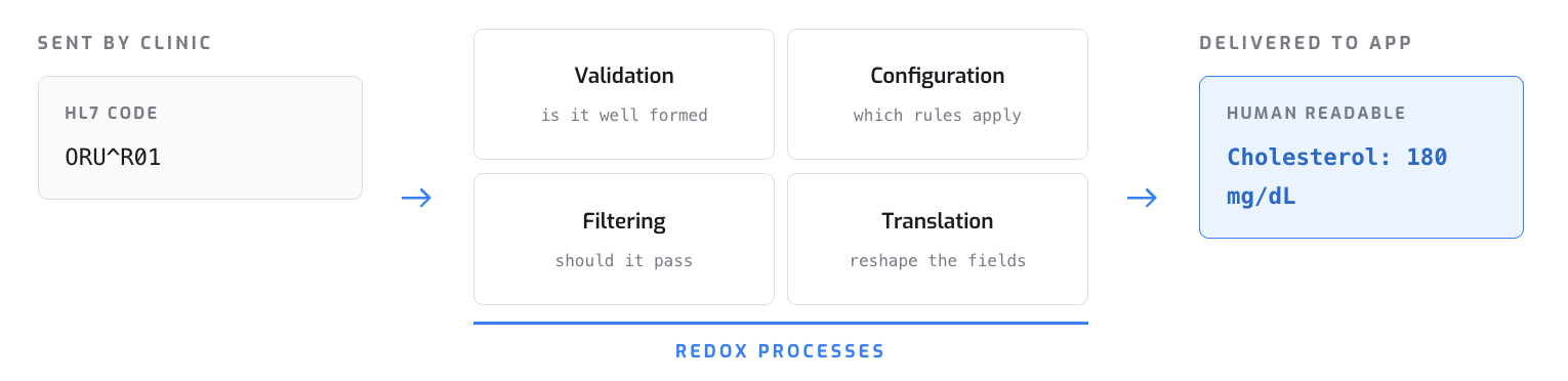
Hospitals, clinics, and apps all speak different data languages. Redox translates between them so patient data keeps moving and stays connected.I designed Log Inspector to open it up and give users clarity, visibility, and control over how their sensitive data moves through Redox.
Problem
Data went in, data came out. What happened in between was a mystery.When something failed, customers had no way to see where or why, so they lost hours troubleshooting.

Process
Understanding the users
Technical
Developers & engineers
Want to dig into the code and the detail of every transformation.
Non-technical
Implementation specialists
Want a clear, simple picture of what happened, without the code.
The challenge: serve both without building two separate tools.
Understanding the underlying data
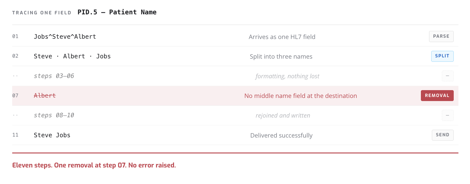
Data in Redox doesn't move in a straight line. A single field can be added, deleted, moved, or reformatted across more than ten processing steps before it lands. So I traced one.
Step 07 dropped the middle name because the destination had no field for it, but the change wasn't flagged as an error.

Exploring designs

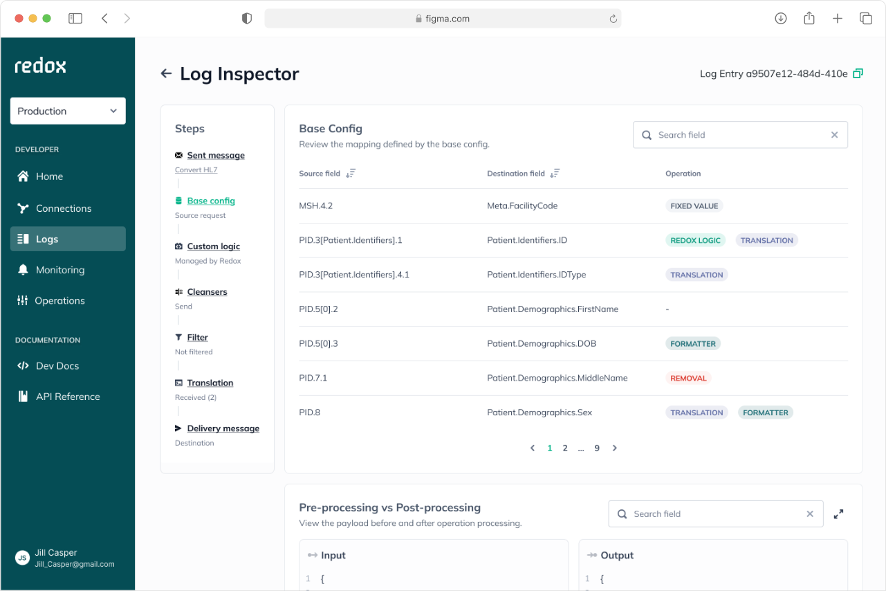
The complexity made it essential to design an experience anyone could understand at a glance. Since we weren't sure which audience to prioritize, I explored separate approaches before combining them into a single experience where users can toggle between levels of detail.
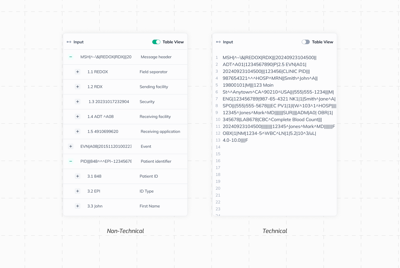
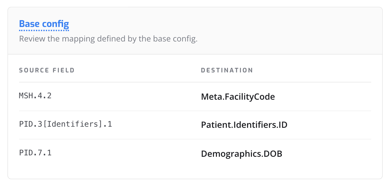
The same message, two different views
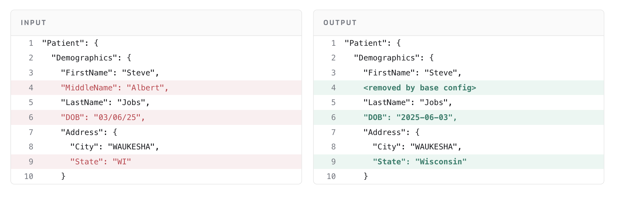
What testing changed

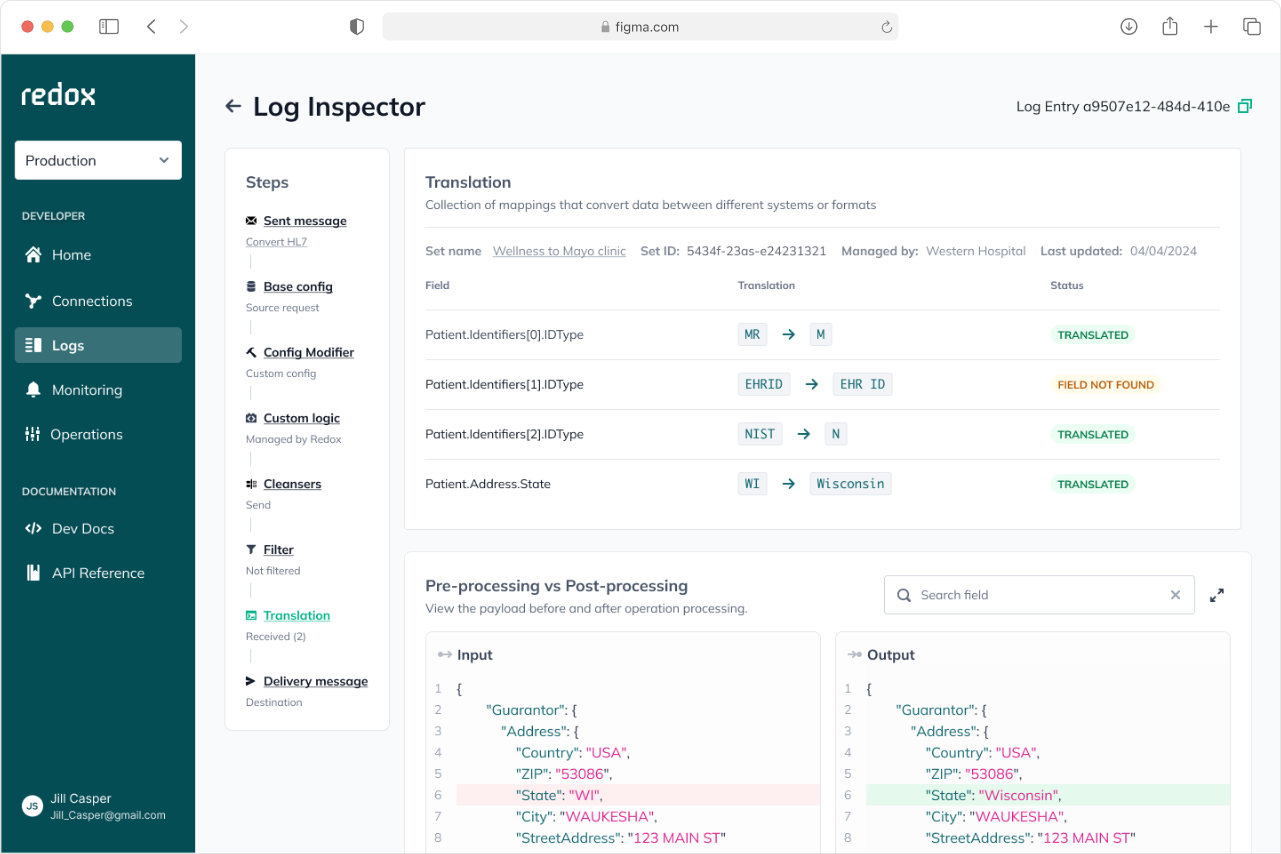
Changes marked, not just shown
Insight:
Side-by-side input and output looked clear, but in testing users couldn't tell what had changed. On payloads this long, modified lines blended in with everything else
Decision
Mark what changed instead of making users compare. It’s easier to read than figure out what’s different.
Definitions in place
Insight:
Specialists encountered unfamiliar terms like “base config” with no way to look them up without leaving the page and losing context.
Decision
Bring the definition to the term instead of sending the reader to a glossary.

Making the invisible visible

Reflection

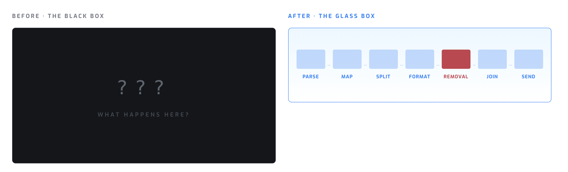
This project was a reminder that great design doesn't happen in isolation. Engineering worked side by side with design to make sure we could visualize the invisible in a way that was both technically feasible and genuinely useful. Getting everyone aligned wasn't always easy, but by the end we had turned a black box into a glass one.
The same eleven steps, and the same message. The only thing that changed is that you can see inside